Accessibility at Scale:
Redesigning a Legacy PDF Tool


.png)
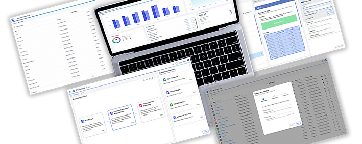
Modernizing a legacy batch-processing tool into a scalable, accessible workflow for enterprise users.
Summary
Enterprise users relied on a legacy PDF accessibility tool to process large batches of documents, but fragmented workflows, poor system feedback, and accessibility gaps made the experience inefficient and difficult to use.
This project focused on redesigning the tool into a structured, accessible workflow.- improving clarity, reducing errors, and enabling users to process files at scale with greater confidence and efficiency.
The Problem
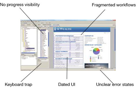
The legacy tool had evolved over time without a cohesive UX strategy, resulting in:
-
Complex, fragmented workflows for batch processing
-
Poor visibility into file status and errors
-
Limited keyboard navigation and inconsistent focus states
-
Accessibility gaps for screen readers and assistive technologies
-
High cognitive load for both new and experienced users
These issues led to slow task completion, frequent errors, and reliance on workarounds or support.
Before:
Role: Lead UX Designer
Owned end-to-end design, including workflow redesign, accessibility strategy, prototyping, and collaboration with engineering. Leveraged and extended the design system to support complex workflows, ensuring consistency, accessibility, and scalability across the experience.
Constraints
-
Maintain feature parity with the legacy system
-
Support high-volume batch processing workflows
-
Align with accessibility standards (WCAG)
-
Transition toward a cloud-based architecture
-
Minimize disruption for existing users
My Approach
AI-Assisted Audit & Workflow Mapping
I used a combination of AI Tools to accelerate:
-
User interview scripts
-
UI audits (identifying gaps in navigation, structure, and interaction patterns)
-
Edge case generation for features
-
User story creation
-
Error state discovery
-
Initial task flow mapping
-
React prototypes
This allowed for rapid identification of problem areas across a complex system.
To begin, I created a script for our interviews utilizing Gemini, then we spoke to users at a variety of client locations using a script created by my custom Claude Agent. Recording these sessions and then feeding them into Dovetail allowed me to utilize Dovetail AI to extract insights and pain points, then share these with the team.
I used Replit for heuristic evaluation, React/HTML/CSS prototype creation, technical feasibility checks and error state design, and then tested with users in A/B test sessions, Lyssna projects and usability sessions with our end users.
The user feedback combined with the team input gave us confidence in our solution which was shipped in 3 releases over 12 sprints.
The end result was an AI enabled team which was able to work 50% faster, 100% feature parity in the new platform, 80% reduced visual clutter, 30% increase in user satisfaction (I have confidence this number will increase as users migrate to the Cloud) and 80% design system compliance (we needed to create a couple of new components that were added to the design system) - a win for brand integrity and reduced technical debt.
Users & Context

1
Compliance Teams
Compliance teams preparing accessible documents at scale
Needs: Clarity and feedback (file status, errors)
2
Enterprise Users
Enterprise users processing large batches of files
Needs: Speed and efficiency (batch workflows)
3
Assistive Tech Users
Users with accessibility needs relying on keyboard navigation and screen readers
Needs: Predictable, accessible interactions
Overcoming Roadblocks
-
Bridging the Design-Engineering Gap
The engineering team was not accustomed to working closely with a Lead UX Designer. Initially, there was a disconnect regarding hand-off expectations and the "why" behind certain UX decisions.
The Solution: I shifted from just delivering files to a collaborative "open-door" approach. I held weekly syncs to walk through Figma prototypes and the analysis of new user interviews to explain the design rationale, which turned skepticism into partnership.
-
Addition of AI Tools
The engineering team had been working on the product for a very long time - their descriptions of what needed to happen were difficult to follow and they weren't sure how to describe how the features worked in the desktop version of the app.
The Solution: Using Claude to vibe code ideas while in brainstorming sessions helped get us all on the same page accelerating discovery.
-
The Keyboard Navigation Debate
I faced significant pushback from front-end engineers on keyboard navigation. While my goal was to ensure W3C compliance, the team was concerned about deviating from the established learned behaviour.
The Resolution: Together, we reviewed the W3C guidelines for keyboard navigation, updating the existing product. This increased the product's accessibility. The Figma handoff included "pixel-perfection, error states, and accessibility guidelines.
-
The Primary Persona
Early in the project, I disagreed with the Product Manager regarding the primary persona. I advocated for a broader range of user types, while the PM insisted on a narrower focus on "The Technical Compliance User."
The Outcome: After conducting user interviews, it became clear the PM was right. The specific needs of technical compliance users drove the bulk of the tool’s value. Acknowledging this early allowed us to pivot our focus toward high-density data views and batch-processing features that mattered most to that group.
-
Pivoting the Toolbar Design
Midway through the prototyping phase, I realized my initial toolbar design was adding too much cognitive load. It was packed with features that looked good in a vacuum but cluttered the workspace in practice.
The Change: I made the difficult decision to scrap the design and restart. I moved secondary functions into a "hidden until needed" state (progressive disclosure), which ultimately led to the 78% reduction in visual clutter noted in the final outcomes.
Technical Collaboration
I worked closely with engineering to ensure:
-
Interaction patterns aligned with front-end architecture
-
Accessibility requirements were implemented using semantic HTML and ARIA roles
-
Designs were production-ready and scalable
My understanding of front-end code allowed me to validate feasibility early and reduce iteration cycles during development. This was also very helpful in using Replit and Claude to create working prototypes I could share with the engineering team. This tool alone saved us 35% of our time in each sprint.


Before & After


After:
Unified workflow with clear stages
This stepper and it's rules were inserted into the design system
User gets real-time feedback on file status and progress
Structured Batch Workflow
Before:
Disconnected steps
No clear progress tracking


After:
Inline error messaging
Clear indication of which files failed and why
Actionable next steps
Error Handling & Feedback
Before:
Errors surfaced late or unclearly
Voice and tone not user friendly
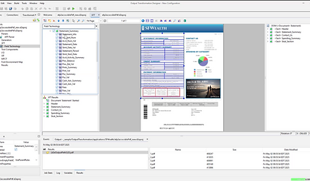
Before:
Dated UI and layout
Design not scalable for large data sets
Repetitive actions and hidden features

After:
Table-based layouts optimized for batch processing
Filtering and sorting for large datasets
Bulk actions to reduce repetitive work
Scalable UI for High-Volume Tasks

Before:
Limited and difficult to use
Non intuitive UI
Disconnected flow

After:
Improved and modernized UI
Added scalability for large batch files and components
Cleaner interface
Improved Flow Diagrams
The Design
Mid-fidelity Prototype
I used Replit and instructed the AI to base decisions on our user interview data along with our design system guidelines to create mid-fidelity wireframes that we iterated on; user stories for feature creation and usability test plans. I adjusted my prompting to steer the design direction.
We used our prototypes to test the viability and feasibility of our solution. When we presented the prototype to key stakeholders, we were able to see whether the solution provided a viable business model and whether it was technically feasible to implement. These crucial factors determined our long-term success.
Our usability testing identified a few areas of confusion around the 2 step process of tag identification, as well as some visual clutter we could reduce by hiding some elements until they are actually needed by the user, based on what we knew from their work flows. Moving secondary functions to a "hidden until needed" state is a systemic rule that can be applied to any complex tool, not just the one we were building.


Hi-fidelity Figma Prototype
Final dev hand off was done in Figma, to pixel perfection including error states, accessibility guidelines and edge cases.
Final Designs


Outcomes
-
Reduced user errors during batch processing
-
Improved task completion confidence in usability testing
-
Faster identification and resolution of failed files
Achievements
-
Bridged the design-engineering gap by utilizing AI Tools to validate systemic component behaviour in real-time
-
Reduced friction in the user flow by 85%
-
Redesigned the interface, reducing visual clutter by 80%
-
Brought the platform into the Cloud with 100% feature parity
-
Increased user satisfaction in the tool by 30%
-
Reduced churn rate by 68%
-
Utilize the design system for 80% of the components
-
Improve self-serve success rate by 30%
-
Architected a reusable batch-processing framework that reduced visual clutter by 78% across the platform
Key Takeaways
-
Accessibility improvements benefit all users by increasing clarity and predictability
-
AI can accelerate discovery - but real user validation is critical for accuracy
-
Modernizing legacy systems requires balancing familiarity with meaningful change
-
Designing for scale means optimizing both interaction and system feedback

Reflection
Modernizing a legacy ecosystem requires shifting from "visual refresh" to systemic evolution.
By integrating AI as a force multiplier, I reclaimed 35% of sprint capacity typically lost to manual audits and used that time to secure 80% design system compliance and navigate complex stakeholder alignment. This approach allowed us to maintain 100% feature parity during a cloud migration while delivering a 68% reduction in churn.
Ultimately, this project proves that when AI handles the heavy lifting of execution, designers can focus on what truly drives business value: advocating for the user and architecting scalable, inclusive systems.