Reducing errors and simplifying a complex, high-risk process to help users complete data imports with confidence.
Improving Data Import Workflows for Clarity and Reliability
Summary
Accountants and auditors rely on accurate data imports to perform critical financial analysis, but existing workflows were confusing, error-prone, and inefficient. This project focused on redesigning the data import experience to improve clarity, reduce errors, and support faster, more reliable task completion in a new cloud-based platform.
The Problem
Importing financial data was a critical but highly frustrating task.
Users struggled with:
-
Unclear steps and lack of guidance
-
Missing or confusing error messaging
-
Rigid workflows that didn’t support real-world data needs
-
Lack of scalability and support for large datasets
This resulted in slow task completion, high error rates, and frequent support requests.
The team struggled with:
-
High ambiguity
-
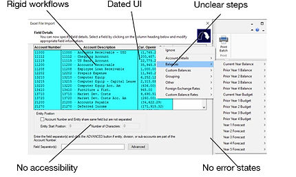
Major UI challenges - how to make a data table accessible
-
New to UX Design process
Role: Senior UX Designer
Led end-to-end design of the data import experience, including workflow redesign, accessibility strategy, and cross-functional collaboration. Leveraged and extended the design system to support complex workflows, ensuring consistency, accessibility, and scalability across the experience.
Before:
Users & Context

Accountants and auditors work with large, complex datasets under tight deadlines, where accuracy is critical.
-
Files often exceed 30,000 records and 2GB in size
-
Data comes from multiple sources (Excel, QuickBooks, etc.)
-
Errors can impact financial reporting and decision-making
My Approach
The challenge was extreme ambiguity and how to handle inconsistent spreadsheets from dozens of different sources. I had to move beyond just 'designing a tool' to defining a system-level workflow that could intelligently map messy data into a structured environment while maintaining 100% user trust. In this project I established a process where accessibility was part of the initial discovery and component architecture. I educated the team on accessibility and showed them why we should care. I focused on keyboard navigation and screen reader semantics so that the data is as powerful for a user with a visual impairment as it is for anyone else. I worked with engineering to perform a heuristic evaluation and understand technical constraints and with users to find where the 'cognitive load' was highest. I designed a predictive mapping interface that allowed users to 'validate' rather than 're-create'.
Overcoming Roadblocks
-
Aligning on a "Source of Truth": Faced with extreme ambiguity regarding data origins, I facilitated cross-functional workshops to define a unified "source of truth." This alignment was critical to ensuring the system could handle inconsistent data without compromising user trust.
-
Negotiating Technical Scope via Phasing: Initially, the development team resisted the full design due to its high implementation cost. Instead of compromising the vision, I designed a phased roadmap that broke the features into manageable chunks. We reviewed this together with Product and Engineering, aligning on a 6-sprint rollout that allowed us to ship the core value quickly while iterating toward the final vision.
-
Managing the 10% Edge Cases: To address the 10% of complex datasets that didn't fit our standard model, we empowered client teams to develop custom import types via an API. This ensured the tool remained flexible for power users without over-complicating the UI for everyone else.
-
Bridging the "SME Gap": One of the primary challenges was overcoming initial resistance from a key Subject Matter Expert who felt the new design didn't align with their established mental model. To shift the dynamic from "my design" vs. "their expertise," I invited them into the co-creation process. We held weekly feedback loops where their domain knowledge directly informed the UI logic. By making them an active contributor to the solution, we transformed a potential blocker into the project’s strongest advocate.
-
The Horizontal Scroll Compromise: Recognizing that accountants are deeply accustomed to Excel-style formatting, I made the strategic compromise to allow horizontal scrolling on data tables. This maintained data density while ensuring familiar navigation patterns for our specific user persona.
-
Engineering-Led Pivot: When technical processing constraints forced a change in the user flow, I proactively redesigned the wizard component. By moving the "Import Type" selection to the start of the journey, we were able to tailor the subsequent steps to the specific data type, turning a technical limitation into a more personalized user experience.
Project Phases
Research: User interviews, whitepapers, competitor analysis, SMEs and internal experts
Workflow mapping: to understand system complexity and identify gaps
AI-assisted audits: to rapidly surface edge cases and accessibility issues
Usability testing (moderated & unmoderated): to identify friction points and observe real task behaviour
Findings were validated through real user sessions to ensure accuracy and relevance.
Key Research Insights
To better understand user challenges and prioritize design decisions, I defined key research questions:
-
Where do users struggle most in the workflow?
-
What causes errors or task failure?
-
What information or feedback is missing?
I used a mix of qualitative and evaluative methods to validate assumptions and uncover usability issues.
User interviews and usability testing revealed consistent patterns:
-
Users didn’t understand the process
-
Errors were surfaced too late and poorly explained
-
There was no clear sense of progress or success
-
The data was often messy
Users weren’t just making mistakes - they lacked the feedback and guidance needed to succeed confidently.
Core Problem:
The import experience lacked clarity, flexibility, and feedback - making a high-stakes task feel risky and difficult to complete.

Design Principles
Key Design Decisions
Introduced a Structured Import Flow
Replaced a rigid, confusing process with a guided, step-by-step experience.
Why: Users needed clarity and direction to complete complex tasks successfully
Added Validation and Error Feedback
Implemented early validation patterns and clearer, more actionable error messaging.
Why: Preventing errors is more effective than reacting to them
Reduced Cognitive Load
Simplified layouts and grouped related information
Why: Dense interfaces slowed users down and increased confusion
Designed for System Consistency
I leveraged existing design system components where possible and introduced new patterns to support complex workflows such as batch processing, error states, and progress tracking.
Why: Ensuring consistency across the experience reduced cognitive load for users and improved development efficiency.
The Solution
The redesigned experience:
-
Guides users through a structured, step-by-step workflow
-
Prevents errors with early validation and clear feedback
-
Provides visibility into progress, success, and next steps
-
Supports flexible data import from multiple sources
User Flows
We used Figma to create the user flows which map out the user's steps to complete the import. This helped us understand the logical sequence of actions and ensured the experience is clear, efficient, and aligned with user goals. The engineers had some valuable insights into the process so we ended up making a few changes to the flow due to the way data is processed b y the back end technology.
Participants were: design, product, engineering, subject matter experts.

Before vs After

Before:
-
Confusing, rigid workflow
-
No meaningful error feedback
-
High user uncertainty and failure rates
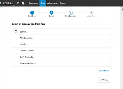
After:
-
Guided, step-by-step experience
-
Clear validation and error messaging
-
Predictable, confident task completion
Prototype and Design Rationale - Figma file
I then created a high fidelity prototype using Figma and since we had our design system in place, most of the components (with baked in accessibility) were already created in addition to our overall brand and design guideline which I followed. The step component for the wizard was new and along the way we created a voice and tone guideline for our personas which was used to improve the error messaging, and altered the button text style based on some user feedback from the usability test phase of this prototype.
Meeting with product and engineering, we broke the project down into sprints and I created a separate Figma page for each user story which contained all the edge case designs and empty states.
Figma Interactions
Included in this screen shot are the interactions shown in Prototype Mode in Figma. They illustrate the interactions including triggers and navigation type designed to make this prototype feel as real as possible. The design system provides variants of each component used to design such things as button states etc.
This was very helpful in testing the interactions and communicating intent to stakeholders and engineers. It bridges the gap between static design and live experience and ensures the design is easy to understand.


Outcome & Impact
The redesigned experience significantly improved usability, efficiency, and business outcomes.
User Experience Improvements
-
40% decrease in user confusion during import
-
50% reduction in support calls related to import errors
-
Faster task completion times across key workflows
Business Impact
-
+1200 new licenses acquired
-
Expanded capabilities with 50+ supported import types
Product & Team Impact
-
Improved usability (SUS score increased to 86%)
-
35% reduction in design iteration cycles
-
25% increase in overall product satisfaction
-
Increased design system adoption to 80% of components
-
Reduced design and development time by creating reusable patterns
-
Improved consistency across workflows, reducing user confusion
Next Steps
-
Continue improving Software Usability Score (SUS)
-
Identify opportunities for further automation and flexibility
-
Add AI data cleansing feature
-
Expand import capabilities and intelligent mapping features


Reflection
This project emphasized the importance of designing for clarity in complex, high-risk workflows. It reinforced that effective UX is not just about enabling tasks, but about guiding users through them with confidence while reducing the risk of error.