Designing a High-Conversion Wealth Management Experience
Transforming a low-engagement experience into a clear,
conversion-focused journey for prospective investors.
Summary
Prospective investors struggled to navigate wealth management offerings due to unclear messaging, weak content hierarchy, and low engagement across key touchpoints.
This project focused on redesigning the experience to improve clarity, guide users toward action, and increase conversion - resulting in significant gains in lead submissions, scroll depth, and new client acquisition.
The Problem
Users working within GAM were experiencing:
-
Cognitive overload due to dense, complex interfaces
-
Difficulty locating key actions and information
-
Inefficient workflows that slowed down task completion
-
Lack of trust
These issues created friction in high-frequency tasks, impacting both productivity and user confidence.
Core Problem:
The interface prioritized system complexity over user clarity, making everyday tasks unnecessarily difficult.
Role: Lead UX Designer
Owned end-to-end design, research strategy, prototyping, and collaboration with engineering.
Users & Context
Before

1
Seasoned Investors
Accumulated wealth, nearing retirement, estate planning needs
Needs: Trust, white glove service, visual cues, compelling CTA
2
Entrepreneurs
financially savvy, impact-driven, and expects a digital-first
Needs: Trust, specialty service, social proof, self directing
3
New Investors
Limited investments, needing information, options for service
Needs: Trust, personal touch, smart content, advisor bios
My Approach
AI-Assisted Research & Workflow Mapping
I used AI-assisted tools to accelerate:
-
Brand for high wealth individuals
-
Usability test planning
-
Initial task flow mapping
This allowed for rapid identification of problem areas across a complex system.
I worked closely with engineering to ensure:
-
Interaction patterns aligned with front-end architecture
-
Accessibility requirements were implemented using semantic HTML and ARIA roles
-
Designs were production-ready and scalable
My understanding of front-end code allowed me to validate feasibility early and reduce iteration cycles during development.
Research Methods
Working with the project manager and the marketing lead, we put together:
-
A competitive analysis
-
Identified key UX patterns
-
Reviewed several research papers to gain audience insights and opportunities
-
Used AI to gain insights on our target audience
Audience Insights
!
Trust is the Primary Currency
Before they engage, they need to believe you are stable, expert, and discreet.
Design Implication: Prioritize visual authority, client success proof,and advisor visibility early on the page.
!
Time is Scarce, Attention is Priceless
This audience skims fast and expects instant clarity.
Design Implication: Use scannable layout, concise copy, and a strong top-of-page message hierarchy.
!
They Are Comparing You
You’re not the only tab open.
Design Implication: Differentiate through tone, visual storytelling, and ease of action - make it feel like a better experience.
!
They Want Personalization Without Effort
“Show me you understand my needs without making me do the work.”
Design Implication: Include flexible content blocks that resonate with specific wealth journeys or values.
!
They Are Sophisticated But Not Financial Experts
They expect strategic depth, but not a finance lecture
Design Implication: Balance clarity and expertise - use plain language thatstill feels intelligent and elite.
!
They Are Looking for a Relationship, Not a Transaction
Long-term advisory is more valuable than a quick sale.
Design Implication: Make the CTA feel personal (“Let’s talk about your goals”) and humanize the brand through advisor bios or short intro videos.
Understanding the User
Through analysis of the interface and common UX patterns, several key pain points emerged:
-
Important actions were buried or visually deprioritized
-
Information hierarchy was unclear or inconsistent
-
Navigation required excessive effort and context-switching
Key Insight
Users weren’t struggling because the system lacked functionality -
they were struggling because the experience made that functionality hard to access and understand.
Brainstorming
Working with the project manager, marketing lead, and a dev lead we reviewed the research and brainstormed together a few different ways:
-
Idea matrix
-
User journey map
-
User flows
-
Used AI to gain insights on colour schemes and flow testing
Idea Matrix
Click to enlarge (note that team comments have been removed)
We completed an Idea Matrix using Mural to help the team focus on ideas that would deliver maximum value with minimum complexity. This helped to accelerate the roadmap and de-risk innovation.

User Journey Map
Click to enlarge (note that team comments have been removed)
The team mapped pain points and opportunities in a Miro experience map to visualize the user journey pain points and opportunities.

The Design
User Flows
The team then translated the research insights into user flows using Figma that balanced user needs with business goals, and allowed us to design the logical flow. This gave us a strong foundation to begin concepting our solution and prioritizing the features for our roadmap.

Wireframes
Working with the designer, we put together a series of wireframes to illustrate the proposed design and then shared these with the broader team for feedback.
Gaining some user feedback at this stage can also be beneficial, to test the delivery of the voice and tone.
Design Rationale
High-net-worth individuals (HNWI) are not casual browsers. They arrive on the page through targeted channels - email outreach, organic search, or paid ads - looking for a signal that this firm understands their world and can deliver results.
To drive conversion, the design must:
-
Immediately communicate value (What does GAM offer me?)
-
Deliver a clear call to action (How do I take the next step?)
-
Remove friction and uncertainty (Is this brand trustworthy? Is it worth my time?)

Trust-Building
Trust is the single most important currency with this audience. Without it, there is no action.
Design elements that build trust:
-
Visual credibility: Understated elegance, premium typography, consistent use of color and grid, and clean whitespace
-
Proof points: Recognizable credentials, performance highlights, expert commentary, advisor bios
-
Humanized tone: Avoid financial jargon - write like a
seasoned, trustworthy advisor

Storytelling and Performance: A Dual Lens
-
Storytelling provides emotional resonance - conveying the “why” behind the brand: legacy, expertise, relationships, and impact
-
Performance ensures every scroll, click, and layout choice is intentional - leading the user closer to conversion
Together, this lens ensures:
-
A compelling narrative (“We understand you, and here’s how we help.”)
-
With measurable outcomes (clicks, scrolls, signups, calls)

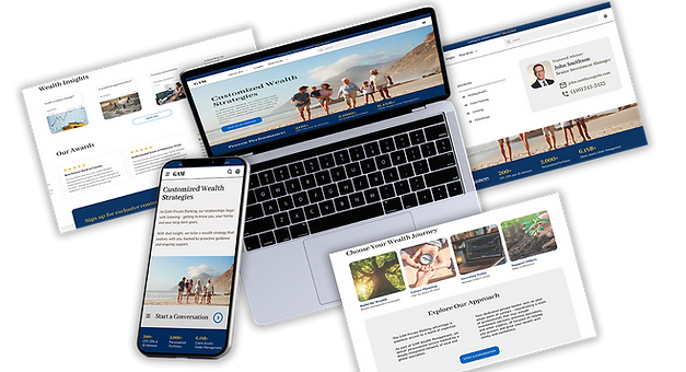
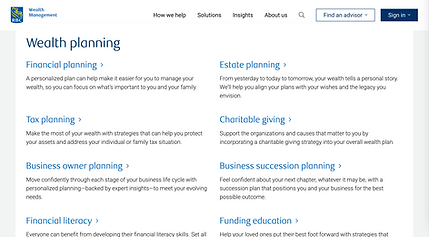
Final Design


Outcome & Impact
The redesigned experience focused on improving clarity, engagement, and conversion across key user touchpoints.
Key Outcomes
-
Increased lead form submissions by 60%
Clearer calls-to-action and improved content hierarchy made it easier for users to take action -
Improved engagement, with an 85% increase in scroll depth
More structured and relevant content encouraged users to explore further -
Growth in new client acquisition by 40%
A more intuitive and trustworthy experience supported conversion -
Enhanced brand perception
A cleaner, more cohesive interface improved overall credibility and user confidence
Next Steps
Measuring Success
Future validation will focus on:
-
Lead form submissions
-
Scroll depth and engagement patterns
-
CTA performance and messaging effectiveness
Further Enhancements
To build on these improvements, next iterations could include:
-
Personalized content for engaged users
-
Client success stories to build trust and credibility
-
An investor-type quiz to guide users toward relevant information


Reflection
This project emphasized the importance of designing for efficiency in complex systems, focusing on making existing functionality more accessible and intuitive. It reinforced that strong UX in enterprise tools comes from clarity, consistency, and reducing friction in how users work.